

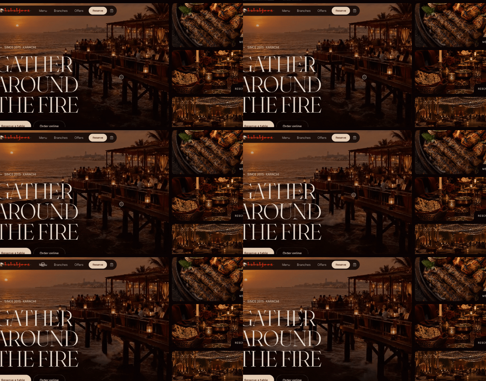
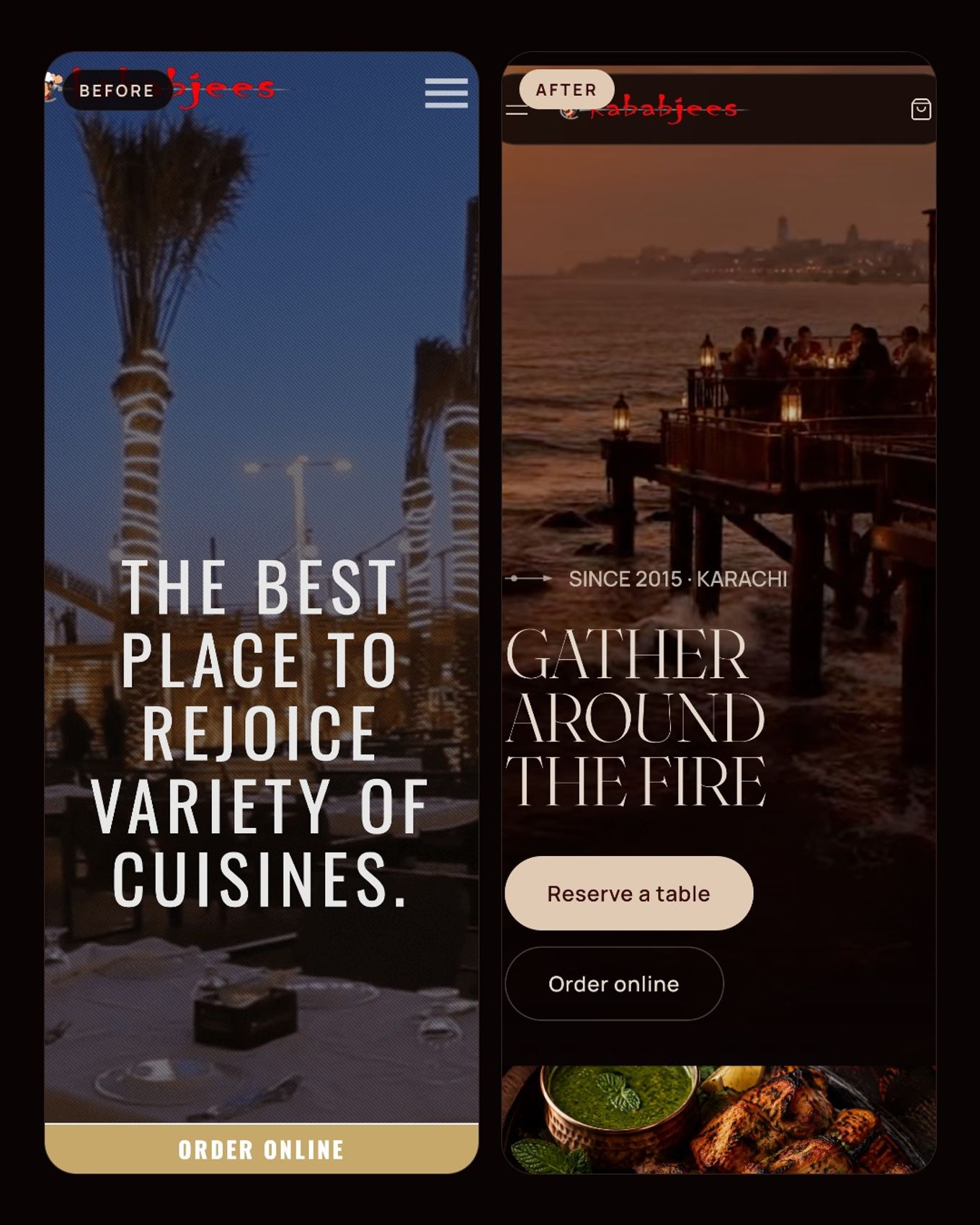
A concept redesign case study. I'm not affiliated with Kababjees, nobody asked me to do this, and the photography on the new site is AI-generated concept imagery. Every number about the current website comes from its public pages, checked on 31 October and 1 November 2026.
TL;DR
- Kababjees is a six-brand food group in 11+ cities. Its website has a ~21 MB homepage, menus hidden in image PDFs of up to 97 MB, a broken
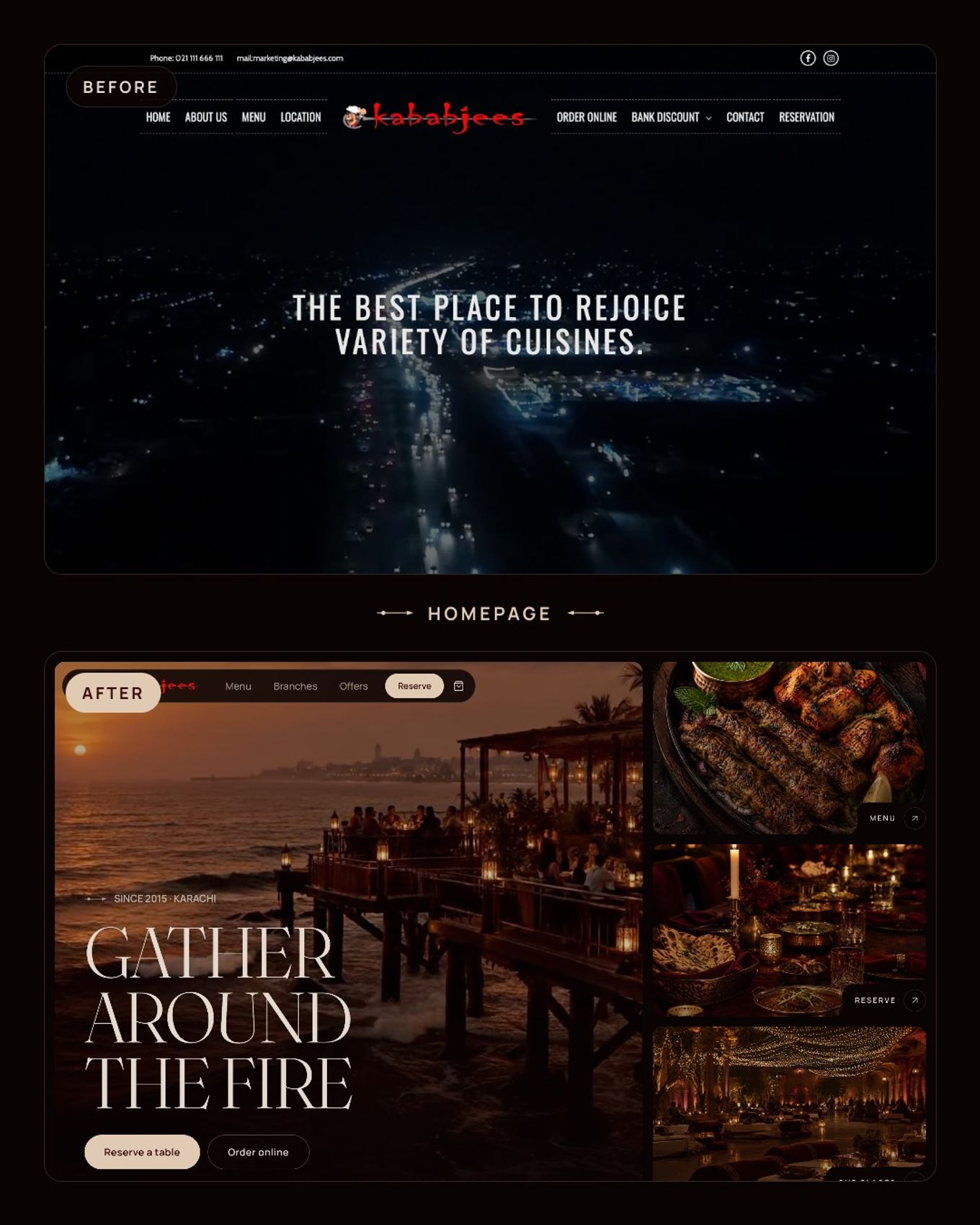
www, and 15+ domains with five different looks. - I audited it (about 70 issues), built a design system around the original logo and a four-colour palette, and designed every page around a user journey instead of a sitemap.
- The result is a 40-page static Next.js site with a working menu, branch finder, reservations and ordering. The homepage weighs about 0.9 MB before the hero video, and Lighthouse scores 98–100 for performance on desktop and 100 for accessibility and SEO.
- The hardest problem wasn't design. Images took 9–10 seconds each on first load, and the fix was to stop optimising them at request time.
Live demo: Rebranded Kababjees
Why Kababjees#
Kababjees started in March 2015 with one grill on Tariq Road in Karachi. Ten years later it's a food group: a restaurant chain with destination branches like Do Darya and the Highway, plus Fried Chicken, Express, Bakers, Pizza and its own bottled water. Six brands, 11 restaurant branches in 7 cities, Fried Chicken in 11 cities, and more than 1,000 dishes on the menu.
That's a brand people drive across the city for. So I opened the website expecting it to feel the same way.
It didn't. And that made me curious: what would Kababjees look like online if the website matched the business it has actually built?
This post is the long version of that experiment. It covers four things:
- The problem: what's wrong with the current site, with numbers.
- The process: research, audit, references, palette, journeys.
- The build: the stack and the decisions behind it.
- The image problem: the engineering bug that taught me the most.
1. The problem: a brand that outgrew its website#
I spent the first day doing nothing but looking. I captured every page of every Kababjees domain on desktop and mobile, saved the raw HTML, downloaded the menu PDFs and bank-discount sheets, and ran Lighthouse and a headless Chrome capture on each site to log load time, page weight, broken requests and alt text.
Here's what stood out.
A 21 MB homepage#
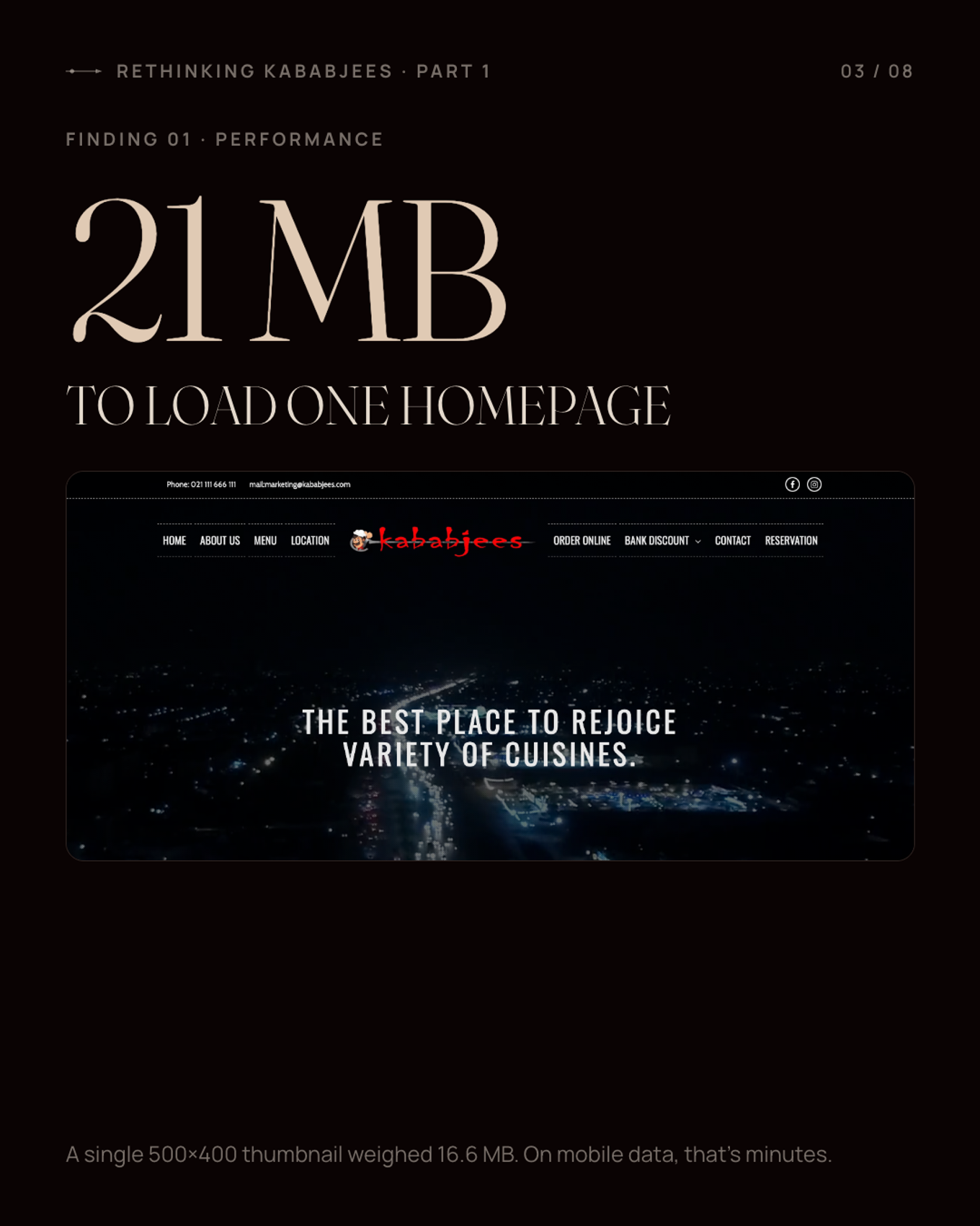
The homepage transfers about 21 MB. One small thumbnail, displayed at roughly 500×400 pixels, weighs 16.6 MB on its own. On mobile data in Pakistan, that's not slow, it's minutes. Lighthouse couldn't record a Largest Contentful Paint within 60 seconds on a simulated 4G connection.
Menus as 97 MB image PDFs#
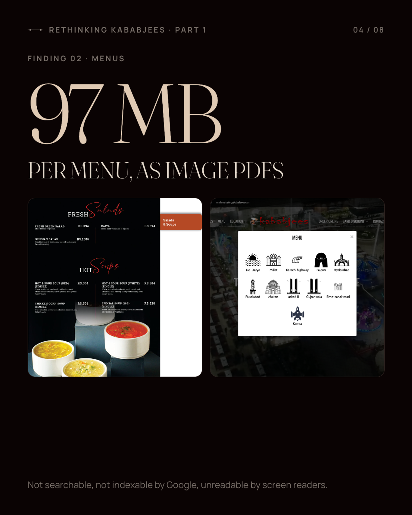
The menus are PDFs, and the PDFs are scanned images: ten files, between 10 and 97 MB each, about 513 MB in total. You can't search them, you can't copy a price, a screen reader can't read them, and Google can't index a single dish.
For a restaurant, the menu is the product page. Here it's the heaviest, least usable thing on the site.
Broken basics#
- www.kababjees.com returns a server error (520).
- Clicking the logo, the one link every visitor expects to work, leads to a 404.
- There's no analytics, so nobody can measure a visit.
- There's no structured data, sitemap or canonical URL.
- Only 26% of images have alt text, and pinch-to-zoom is disabled on mobile.
Fifteen sites, five identities#
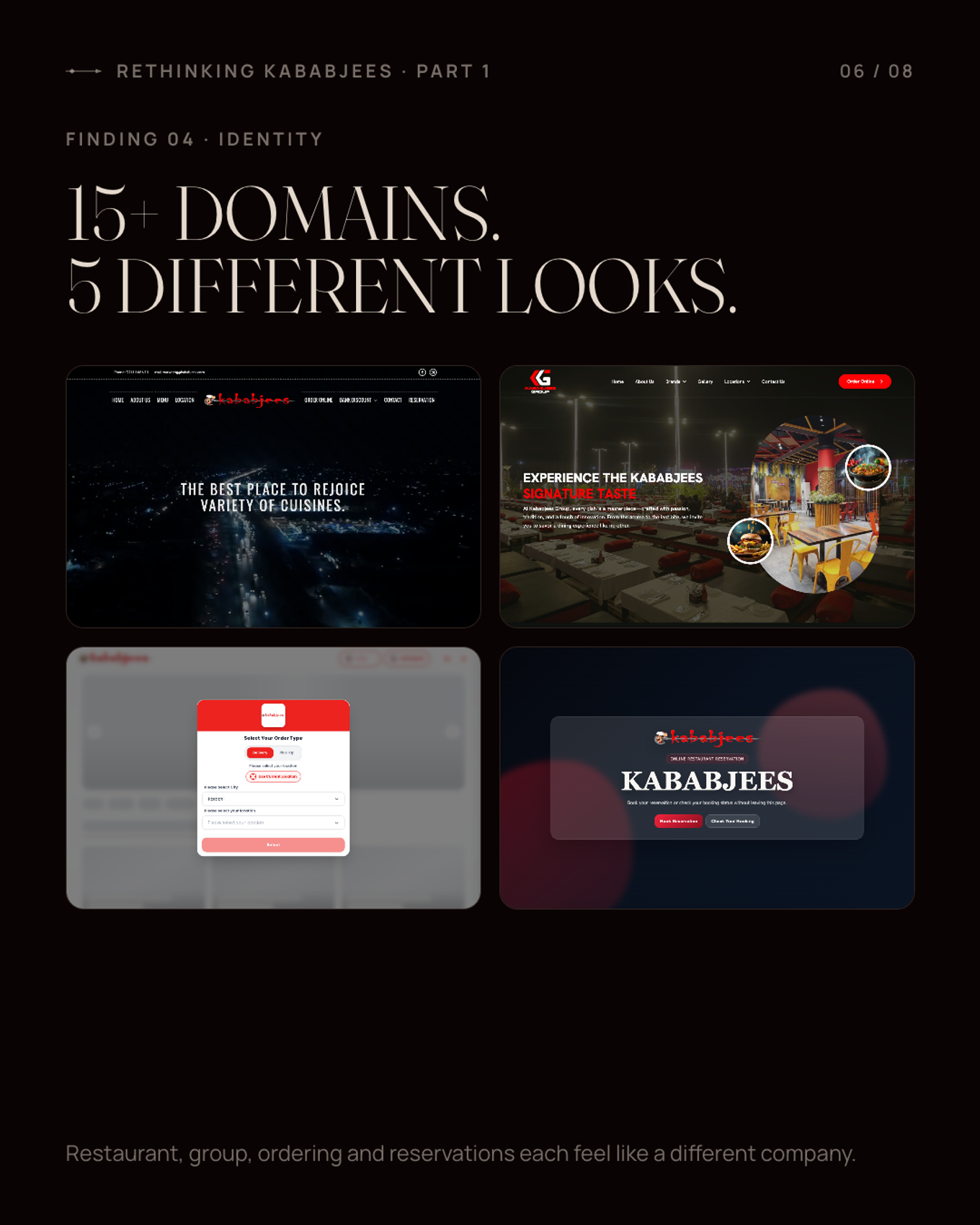
Kababjees runs 15+ domains and sub-domains. The restaurant, the group site, Fried Chicken, Bakers and the ordering storefronts each look like a different company: different fonts (eight families in total), different colours, different navigation.
Copy that fell behind#
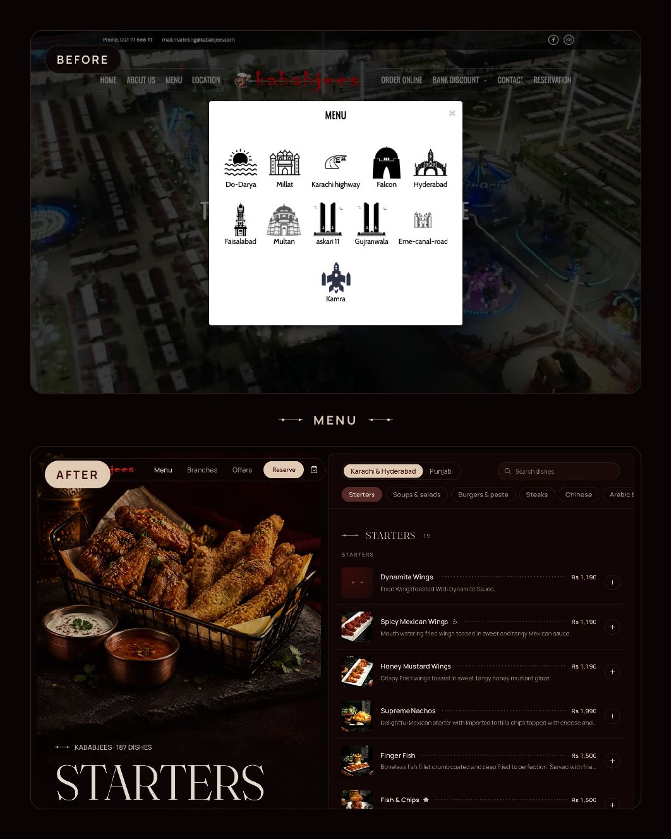
The homepage still talks about "four branches", directly above a list of eleven. Hours are a long wall of text. Menus and ordering are hidden behind pop-ups of city icons.
None of this is a dig at the team. It's what happens to almost every business that grows faster than its website: each new brand gets a new site, each launch adds a PDF, and nobody owns the whole thing.
But it does mean the website undersells the brand.
2. The process: research first, pixels last#
I gave myself one rule: no design work until I understood the business and could name what was broken. Every design decision had to fix a specific problem from the audit.
Step 1: Understand the business, with real data#
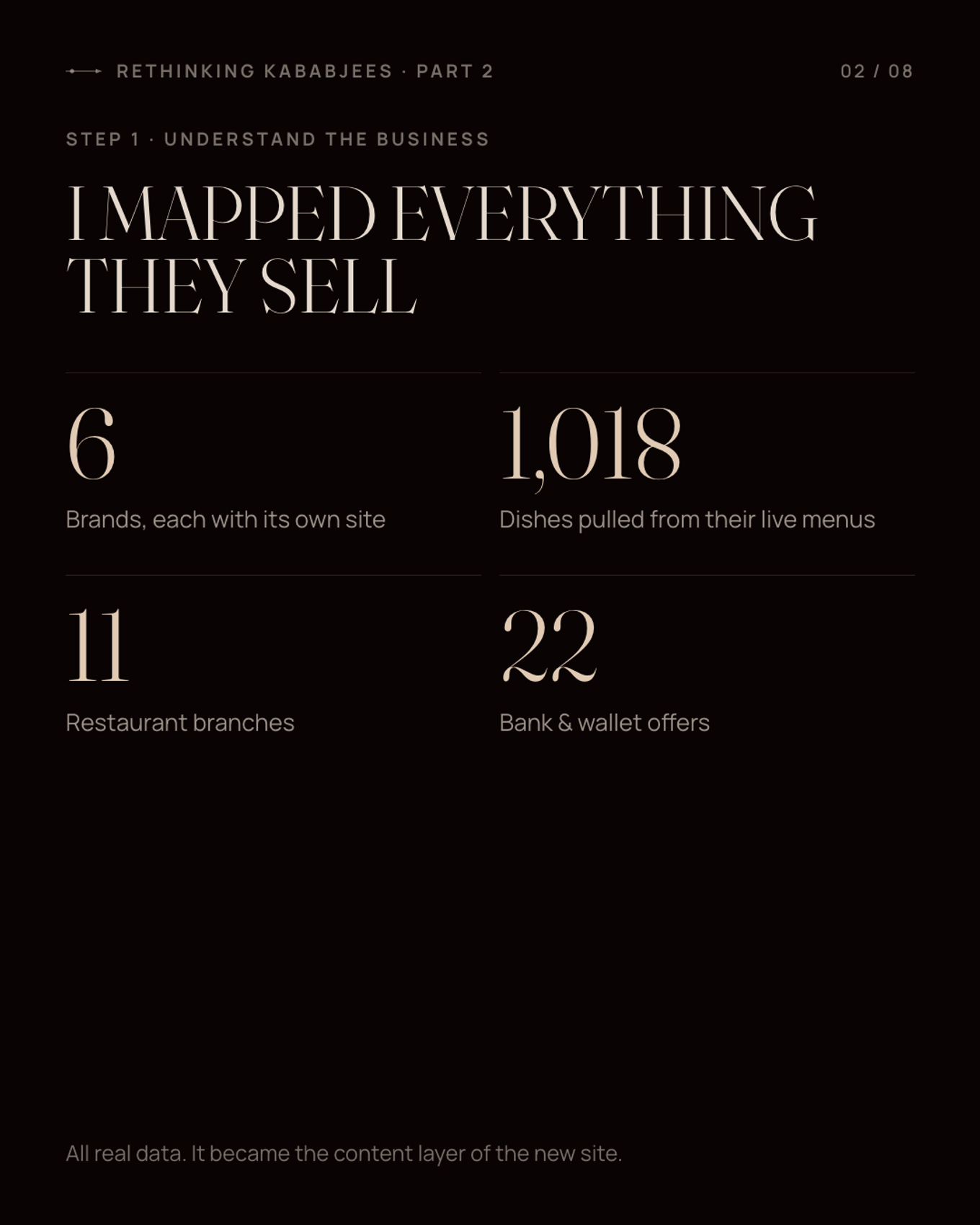
Instead of writing lorem ipsum, I pulled the live menus from Kababjees' ordering platform. That gave me 1,018 dishes across 6 brands, with real names, descriptions, sizes and prices, plus 11 branches with hours and map links, and 22 bank offers transcribed from the discount PDFs.
That data became the content of the new site. Every dish, price, branch and offer on the demo is real. Only the photography is concept imagery.
Step 2: Audit before designing#
I wrote up about 70 issues and ranked each one:
| Severity | Examples |
|---|---|
| Critical | Broken `www`, the logo linking to a 404, 97 MB menus, the 21 MB homepage, no analytic |
| Major | Five identities across 15+ domains; a single page that dumps everything; menus and ordering hidden in pop-ups; no structured data, sitemap or canonical |
| Minor | Typos, missing alt text, zoom disabled, outdated copy |
Then I turned the audit into a design brief. Each row in the table below is a problem with the response I committed to before drawing anything:
| Problem today | Design response |
|---|---|
| 15+ domains, 5 unrelated looks | One master site with a hub per brand, all on one design system |
| One long page with everything dumped on it | Separate pages built around focused journeys |
| 10–97 MB image PDF menus | HTML menus from the real data: searchable, with sizes and prices |
| No branch pages | One page per branch: hours, live open/closed status, map, menu, reserve |
| Bank deals hidden in PDFs | An offers page you can filter by bank, city and day |
| No story, no proof | The Tariq Road origin story, the numbers, real reviews |
I also wrote down what success looks like, so I'd know when to stop:
- A first-time visitor understands who Kababjees is within 10 seconds.
- Every main task takes 3 clicks or fewer.
- It feels like a premium dining house, not a food-delivery template.
- Every flow works end to end in the demo.
- The homepage loads in about 1.5 MB or less and scores 90+ on Lighthouse.
Step 3: Borrow behaviours, not looks#
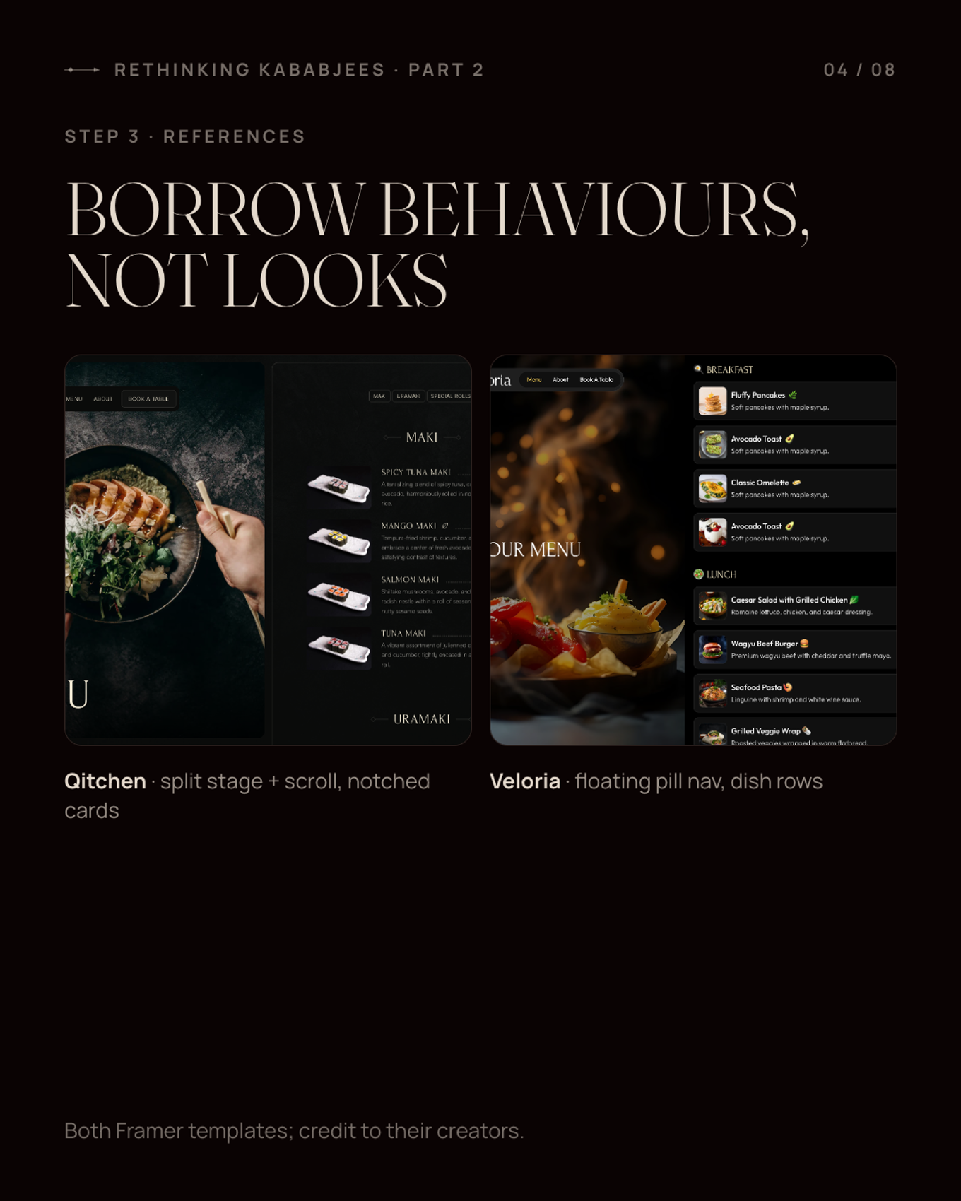
I studied premium restaurant sites and picked two Framer templates as behaviour references. I took interaction patterns from them, not visuals:
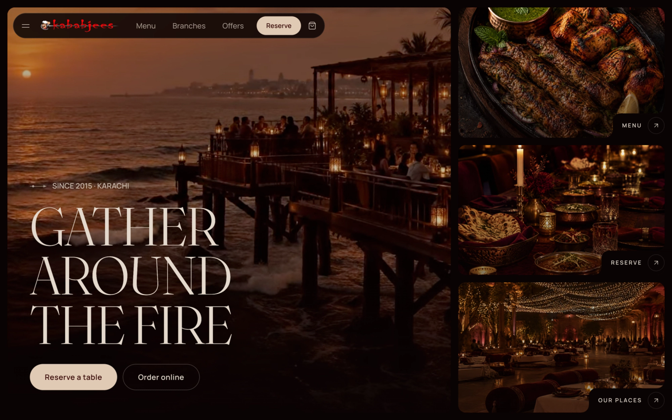
- Qitchen: a fixed image on one side, content scrolling on the other; image tiles with a circular arrow tucked into a notched corner; a full-screen overlay menu.
- Veloria: a floating pill navigation, and clean horizontal dish rows with a price on the right.
I left a lot behind too: orange accents, stock photos, cramped 10 px body text, and Qitchen's nested scroll container, which hurts accessibility, mobile and the back button. I got the same look with position: sticky and normal document scrolling.
Credit to both templates' creators:
- The Veloria Restaurant Template by Framer Geeks
- Qitchen Restaurant Template by Pawel Gola
Step 4: Keep the logo, build a palette with rules#
The original Kababjees logo, the red brush wordmark with the skewer and the chef mascot, stays exactly as it is. No redraw, no recolour, no effects. A redesign shouldn't erase a mark people already recognise.
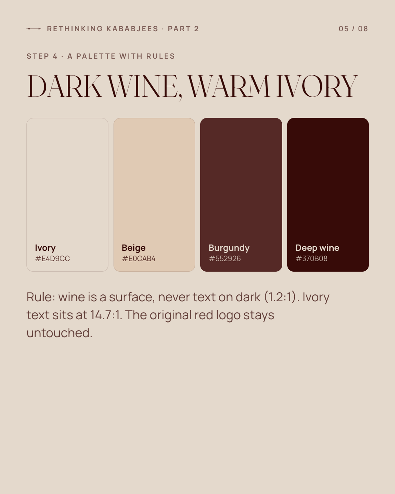
Around it sits a four-colour palette: Ivory #E4D9CC, Beige #E0CAB4, Burgundy #552926 and Deep Wine #370B08. The dark neutrals are mixed from wine toward black, so every dark tone stays warm. The page background went down to #0A0303 so the red logo sits directly on it at 4.7:1 contrast, with no white plate behind it.
The palette came with rules, because a dark palette fails quickly without them:
| Pair | Contrast | Rule |
|---|---|---|
| Ivory on near-black | 14.3 : 1 | Body text |
| Beige on near-black | 12.6 : 1 | Headings, button labels |
| Ivory on wine | 12.4 : 1 | Text on wine surfaces |
| Wine on near-black | 1.15 : 1 | Never text. Surfaces only |
Wine and burgundy are surfaces, glows and selected states, never text on dark. Two or three times a page the layout flips to an ivory band with wine text. That rhythm is what makes it feel editorial rather than like a dark template, and it lets the food photography supply all the saturated colour.
Typography is two families plus an accent, down from eight: Fraunces, a warm high-contrast serif, for display; Manrope for body and UI, with tabular figures so prices line up; and a single Urdu word in Noto Nastaliq per section at most.
One small brand detail ties it together. The original logo has a skewer running through the wordmark, so I turned that into a skewer rule: a hairline with a pointed tip and one bead. It's the section-title ornament, the stepper track in forms, and the confirmation tick. It links the new system to the old identity without touching the logo.
Step 5: Journeys, not pages#
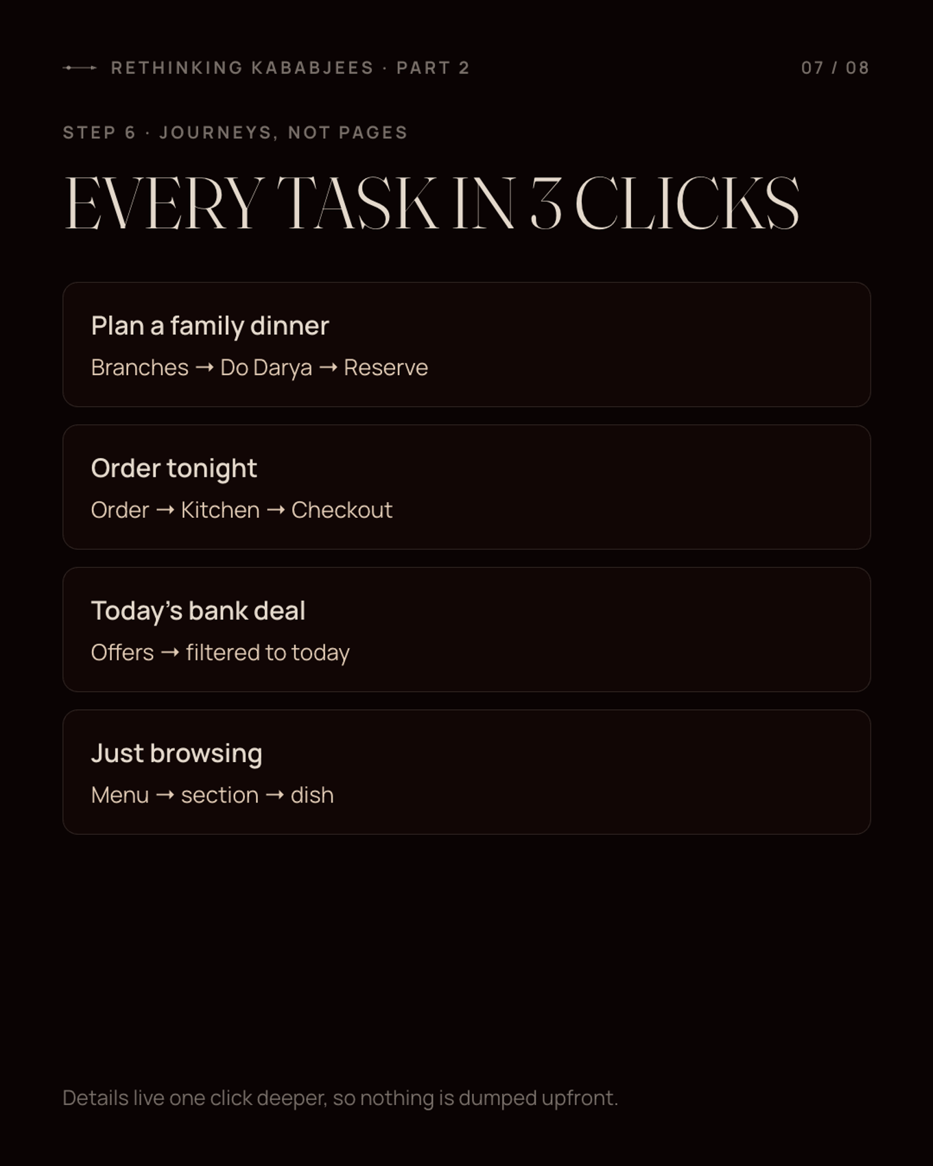
A sitemap tells you what pages exist. A journey tells you what someone is trying to do. I designed around journeys:
- "Plan a family dinner this weekend." Find a destination branch, check it's open, reserve a table.
- "Order dinner tonight." Pick a brand, delivery or pickup, add dishes, check out with a bank discount.
- "Which card gives me a discount today?" Offers filtered to today, your bank and your city.
- "What is Kababjees?" The story, the six brands, the proof.
Each primary task takes three clicks or fewer. Detail lives one click deeper, so nothing gets dumped on the homepage.
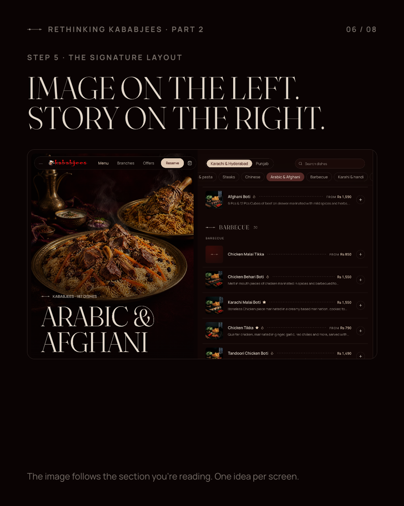
The signature layout came out of this: Stage + Scroll. A sticky image (the stage) fills one half of the screen with a large serif title, and the content scrolls on the other half. On a menu page, scrolling into the barbecue section crossfades the stage to a barbecue photo and updates the title. You always see one idea at a time, and the image tells you where you are. On mobile the stage collapses to a header card and the category chips become a sticky horizontal scroller.
Step 6: Visuals#
I didn't have access to a photo shoot, so I art-directed the photography with AI: the venues at golden hour, signature dishes, cut-out dishes for the cards, and a short hero video. I wrote a shot list before generating anything, so every image had a page and a purpose. All of it is labelled as concept imagery on the site.
I wrote a design document before any code#
All of the above went into a design document before I opened an editor: the brief, the research summary, the references, the palette with measured contrast, the type scale, the components, the motion rules, the page-by-page specs, and the open decisions. That document is the reason the build took days instead of weeks. When a question came up mid-build, the answer was usually already written down.
3. The build: a static site with flows that work#
Stack#
- Next.js 16 (App Router), fully statically generated. Every brand, branch and menu page is pre-built with
generateStaticParams: 40 pages in total. - Tailwind CSS v4, with the palette, type scale and spacing as CSS variables.
- Motion for animation.
- TypeScript throughout. All copy and content lives in one typed constants module, so a bad edit fails the build instead of breaking a page.
Kababjees' content changes a few times a year. There's no reason to render a menu on every request, so every page is HTML on a CDN.
"Fake but working" flows#
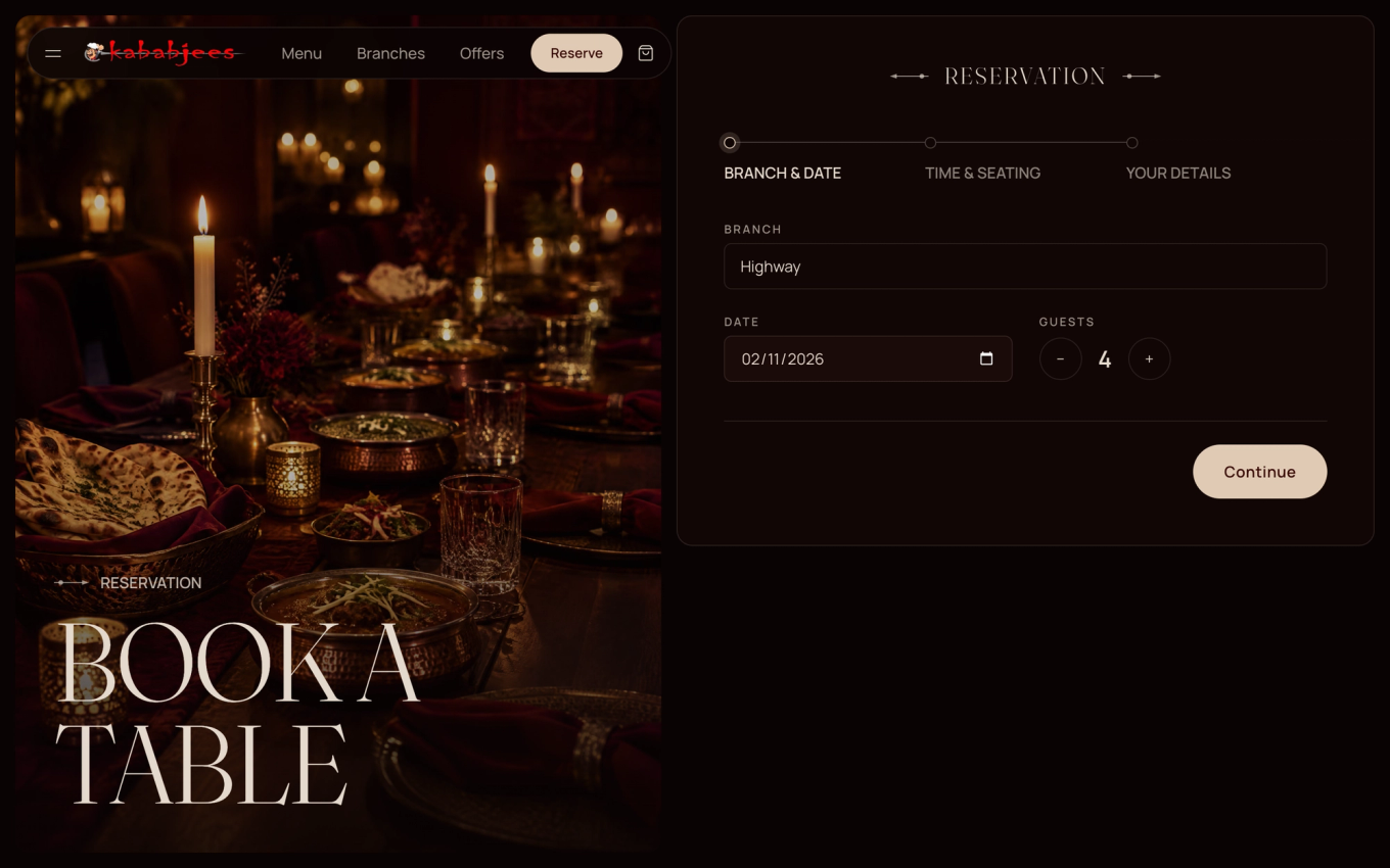
A pitch is more convincing when you can actually use it. So everything works end to end: browse the menu, add dishes to a cart, apply a bank offer at checkout, place an order and watch the tracker move, or reserve a table in three steps.
There's no real backend behind it, and that was deliberate. Every form posts to a single API route that writes the submission to a JSON file. No database, no admin panel, no payment gateway, no integration with the ordering platform. It's enough to prove the experience without pretending to be production.
What changed, page by page#
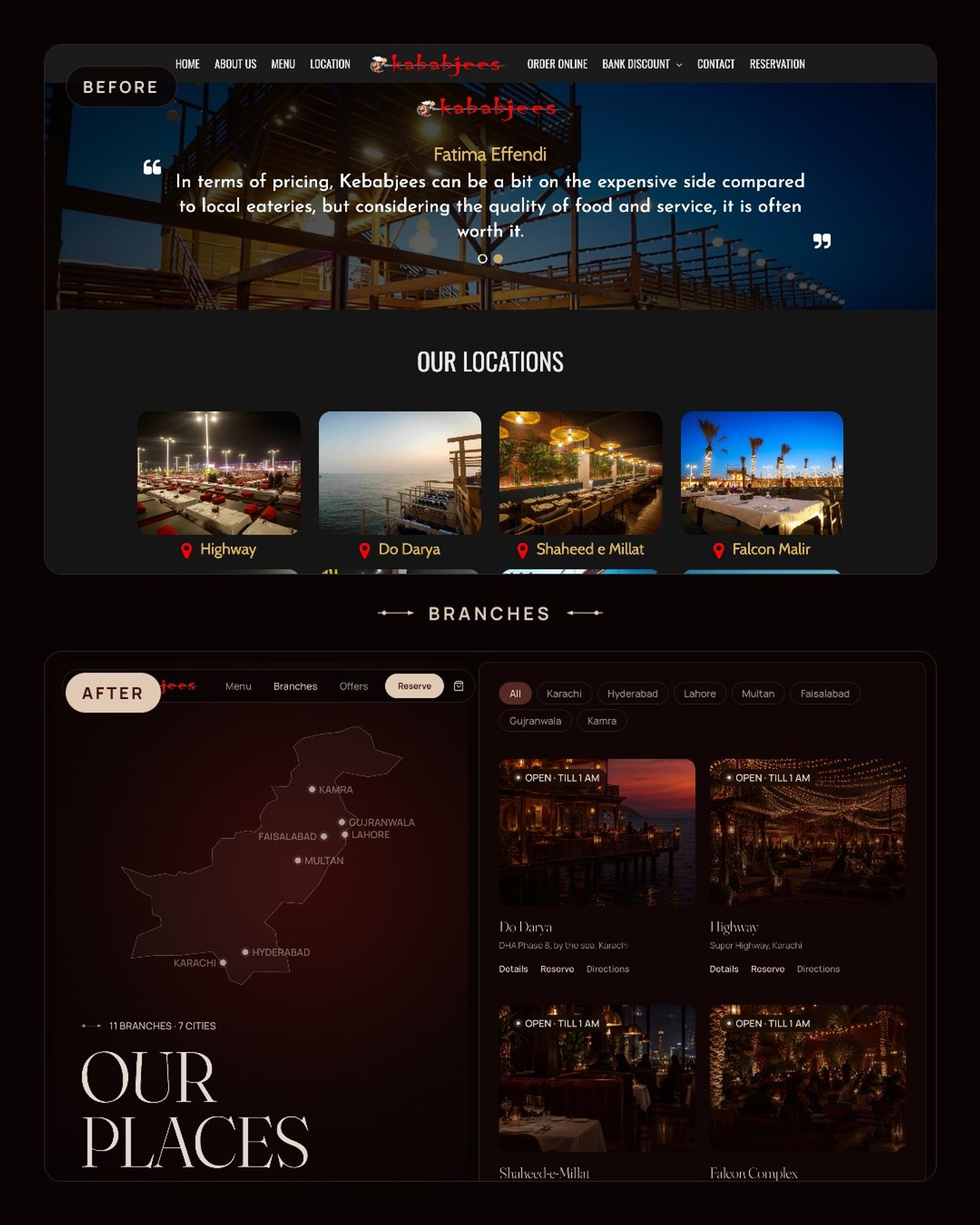
- One home for all six kitchens, instead of 15+ disconnected sites. Each brand gets a hub with its original logo.
- Menus you can browse and search: 1,000+ dishes with sizes and prices, a city toggle where Karachi and Punjab prices differ, and a dish sheet with details. The old 97 MB PDFs become pre-built HTML, backed by 22–134 KB of menu data per brand.
- A page for every branch, with live open/closed status calculated from its hours, directions, its menu and a "reserve here" button. The branches page has a map of Pakistan.
- Bank offers filtered to today, as ticket-style cards, instead of six PDF tables.
- Reservations in three steps, and checkout with your bank discount applied.
Motion, kept on a short leash#
The design document originally listed nine signature animations, including drifting smoke and floating dishes. I cut it to six: a reveal on scroll, the stage crossfade, a page transition, overlay and drawer reveals, small hover states, and a bump on the cart count when you add something.
Every animation lives in one folder of motion components. Pages never import the animation library directly, which keeps the motion language consistent and easy to tone down. Everything animates only transform, opacity and clip-path, and the whole site honours prefers-reduced-motion: reveals become instant and the hero video becomes a still.
The polish pass#
The first Lighthouse run on the homepage was 78 on mobile. These fixes took it to 98:
- Hidden first paint. My scroll reveals rendered at
opacity: 0in the server HTML, 31 elements on the homepage alone, so content stayed invisible until JavaScript loaded. Above-the-fold content now uses a CSS-only entrance; JavaScript reveals are only used below the fold. - Fonts. Dropping one variable axis from Fraunces cut the preloaded font from 120 KB to about 67 KB. This was the biggest single improvement to Largest Contentful Paint.
- Hero. A still image is the LCP element. The video only loads after
window.load, fades in, and never plays with reduced motion. - Contrast. Faint text went from 42% to 58% ivory, so it clears 5.2:1.
- SEO. Organization, WebSite and Restaurant JSON-LD, a Restaurant schema per branch, an Open Graph image, a sitemap and robots file.
Mobile LCP went from 5.7 s to 2.3 s on the homepage.
4. The image problem: a static site with 10-second images#
This is the part I learned the most from.
After the polish pass, the site scored well, and then I tried it on a fresh server. The HTML arrived in 0.12 seconds. The images took ten seconds to appear.
What was happening#
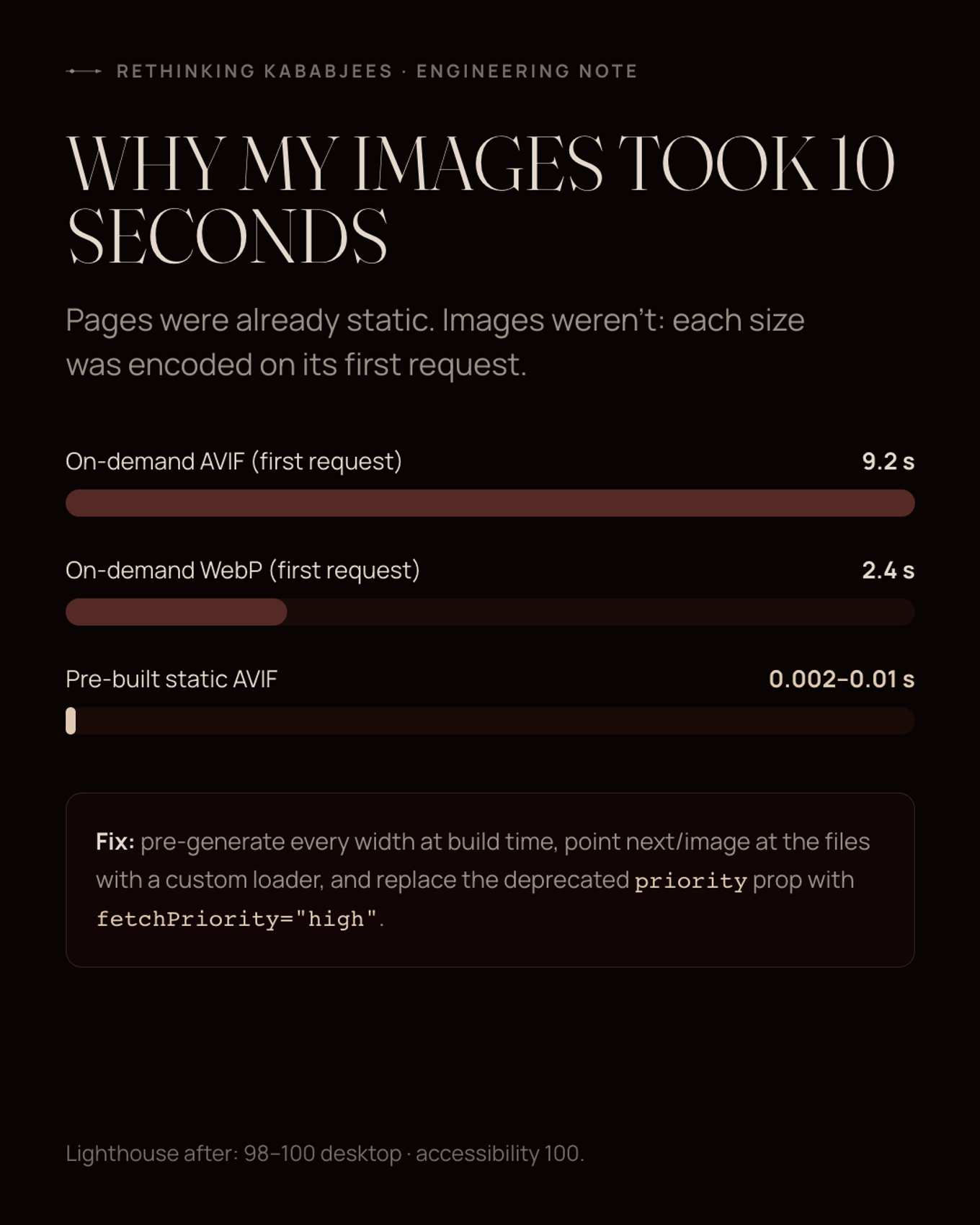
next/image optimises images on demand. The first time anyone asks for a particular image at a particular width, the server encodes it on the spot, then caches the result. As AVIF, that encoding took 9–10 seconds per large photo (WebP took about 2.4 s). And every rebuild cleared the cache, so the first visitor after each deploy paid the full cost again, for every image, at every width.
The pages were static. The images weren't.
The fix: make the images static too#
- Pre-generate every width at build time. A script uses
sharpto encode each photo as AVIF at every width the site requests (256 to 1920 px), and dish thumbnails as WebP at 256 and 640 px. The output goes topublic/media/_w/<width>/. - A custom
next/imageloader. It maps eachsrcsetentry to the matching pre-built file, so there's no encoding at request time:
export default function staticImageLoader({ src, width }: { src: string; width: number }) {
  if (src.startsWith("/media/")) {
    const isMenu = src.startsWith("/media/menu/");
    const widths = isMenu ? MENU_WIDTHS : PHOTO_WIDTHS;
    const w = widths.find((x) => x >= width) ?? widths[widths.length - 1];
    const file = src.slice("/media".length);
    return `/media/_w/${w}${isMenu ? file : file.replace(/\.webp$/, ".avif")}`;
  }
  return `${src}${src.includes("?") ? "&" : "?"}w=${width}`;
}- The widths in
next.config.tscome from the same constants file, so the loader and the config can't drift apart. - Download third-party photos once. The 816 dish photos from the ordering platform are fetched at build time, so no request depends on someone else's CDN.
- Fix the hero's priority. Next 16 deprecated the
priorityprop, and my hero image had quietly dropped to normal priority. It now usesloading="eager"withfetchPriority="high". - Plain blur previews. The default blur placeholder wraps the preview in an SVG filter, which cost about 1.3 s of main-thread time on a slow phone. Passing the previews as plain data URLs removed that.
Result: a cold server now returns an image in 0.002–0.01 seconds, down from 9–10. The trade-off is about 63 MB of pre-built images to deploy, which is fine for a CDN.
The lesson I'll keep: "static site" doesn't mean static images. Check your image pipeline, not just your pages.
The numbers#
| Before (kababjees.com) | After (concept) | |
|---|---|---|
| Homepage weight | ~21 MB | ~0.9 MB before the hero video |
| Menus | 10 image PDFs, up to 97 MB each | Searchable HTML, 22–134 KB of data per brand |
| Sites | 15+ domains, 5 identities | One site, one design system, six brand hubs |
| Branch pages | None | One per branch, with live open/closed status |
| Typefaces | 8 families | 2 + 1 accent |
| Alt text coverage | 26% | Every content image (decorative ones marked empty) |
| Lighthouse (desktop) | LCP didn't finish in 60 s on 4G | 98–100 performance, 100 accessibility, 100 SEO |
| Pages | - | 40, all pre-built |
What I'd do differently, and what's still open#
- Mobile LCP on image-led pages (menus, branches) is still 3.1–3.7 s under simulated slow 4G. The stage images are big by design. A CDN in front of the site should help; smaller stage crops on mobile would help more.
- The photography is a stand-in. AI got me convincing concept shots for a pitch, but a real brand should use real food from its real kitchens. The shot list is ready for a photographer.
- The flows stop at the edge of the demo. Plugging into the actual ordering platform, a payment gateway and a reservations system is real work, and I scoped it out on purpose.
- I'd confirm the numbers with the client. Branch counts and cities change; everything here is accurate to the public site on 31 October 2026.
- Urdu. The type system was chosen to support it, but I didn't ship a translation.
Takeaways#
- Research first, pixels last. An audit with severities turns opinions ("it looks dated") into a brief ("the menu can't be indexed").
- Design around what people are trying to do. Three clicks to a reservation beats a homepage with everything on it.
- Keep what people already recognise. The original logo stayed untouched. The system around it did the work.
- Constraints make a palette usable. "Wine is never text on dark" is worth more than the hex codes.
- Measure the whole pipeline. My pages were fast from day one. My images weren't, and I only found out on a cold server.
If you work at Kababjees and any of this is useful, it's yours to take.
If you build restaurant sites, I'd like to hear how you handle menus and images. And if you've had to order from a worse restaurant website, tell me about it.
Try the demo: Rebranded Kababjees
Concept project. Not affiliated with Kababjees. Visuals are AI-generated; menu, prices, branches and offers are real data from Kababjees' public channels.

Software Engineer and Researcher, writing about AI, developer tooling and automation.